
Card design
Anki Card Design: 12 Best Practices for Language Learning
Design clearer language-learning Anki cards with one retrieval target, honest prompts, readable layouts, useful media, and sustainable card counts.
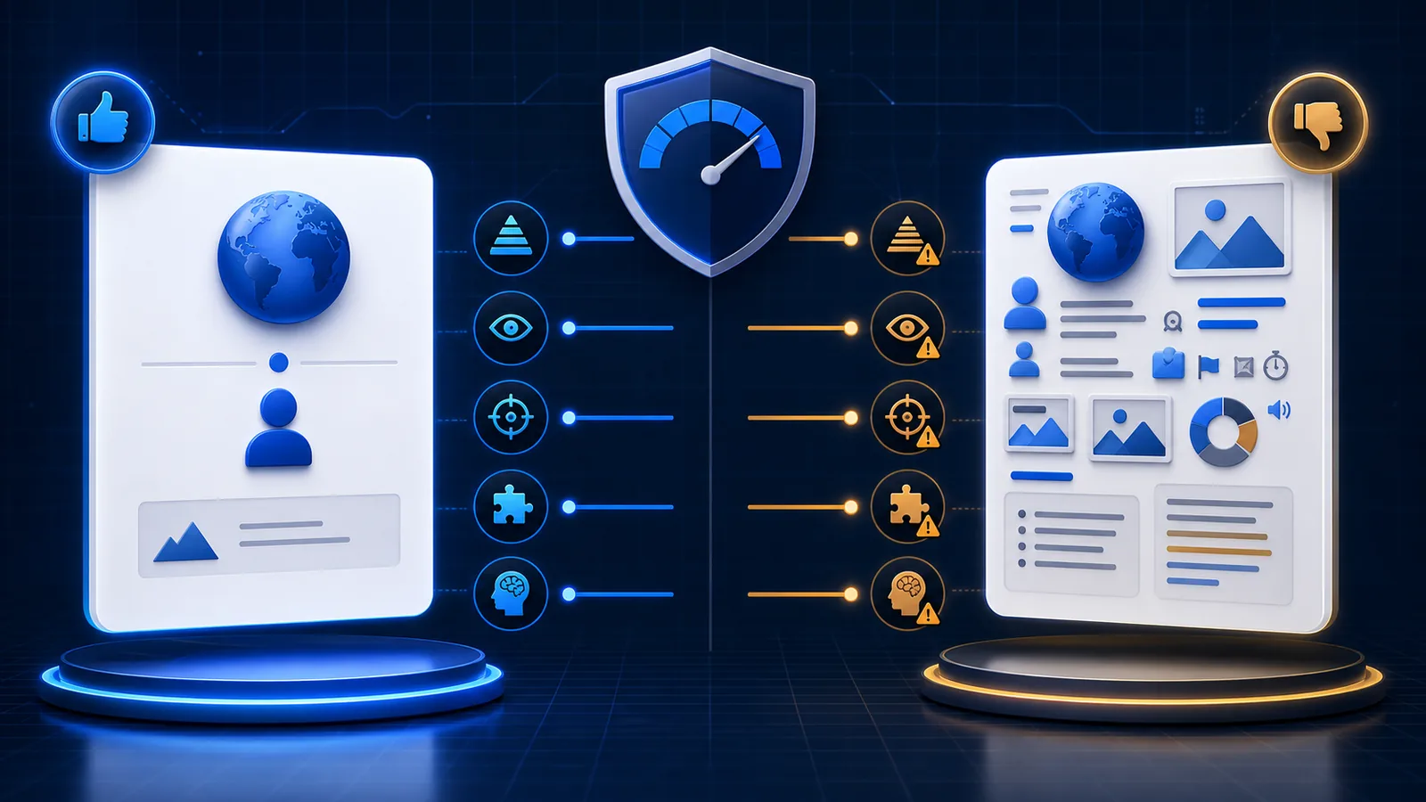
Anki card design is the design of a retrieval task. Fonts and colors matter because they affect readability, but the deeper question is whether the front asks one fair question and the back helps you correct a miss.
Design the retrieval task first
1. Name the behavior
Write a sentence that begins “During this review, I will…”:
- understand one written sentence;
- recognize one spoken utterance;
- supply one constrained form;
- spell one expression; or
- produce one phrase for a specific situation.
If the sentence contains several verbs, split or simplify the task.
2. Keep one main target
One natural sentence may contain several unknown items, but the card needs one reason to exist. Mark one focus phrase and move secondary research into optional Notes—or skip the sentence.
3. Make the prompt fair
A fair prompt gives enough context to identify the intended response without revealing it. “Translate: I went” is often too open. A complete target-language sentence for recognition is fair; a production scenario that requires a named pattern can also be fair.
4. Avoid answer leakage
Keep the transcript off an audio-first front. Move an image that visually translates the sentence to the back. Do not put a near-synonym or cognate beside the blank unless that cue is part of the skill.
5. Match feedback to the goal
The back should answer “Was my response good enough, and what should I correct?” Show the complete sentence, contextual meaning, transcript, audio replay, or one short note. Do not force the learner to scan an essay after every answer.
Choose content worth repeating
6. Prefer natural language
Save an example you encountered in real or carefully edited material. Generated examples can help, but verify that grammar, meaning, and register fit the intended situation before scheduling repeated exposure.
7. Preserve recoverable context
Store a source title and timestamp for video-derived cards. Context lets you check a disputed transcript, hear the surrounding prosody, and repair the card later. Keep that source on the back so it does not become a hint.
8. Use media only when it changes the task
Audio is essential for listening and pronunciation feedback. An image is useful when it preserves a scene or identifies a referent. A video clip is useful when motion, gesture, or timing matters. Decorative media increases download and review cost without improving the retrieval.
For a direct format comparison, see video clips vs audio and screenshots.
9. Control card count
Every reverse template, Cloze number, and listening variant can create another scheduled card. A note with rich fields can still produce one card. Add a direction only when it trains a distinct skill.
Make the layout readable
10. Build visible hierarchy
The prompt should dominate the front. On the back, make the answer easy to find before secondary translation, notes, tags, or source details.
Use semantic wrappers in the template:
<div class="sentence">{{Sentence}}</div>
<div class="meaning">{{Meaning}}</div>
<div class="source">{{Source}}</div>
Then style them centrally. The Anki card CSS guide includes a mobile-friendly baseline with night mode and responsive media.
11. Test real constraints
Preview:
- the shortest and longest sentence;
- a missing optional image or audio field;
- a right-to-left script;
- a phone-sized screen;
- day and night modes; and
- an actual typed-answer review if typing is enabled.
The editor preview is useful, but a real review exposes autoplay, focus, scrolling, and input behavior.
12. Keep the front quiet
Reduce competing borders, icons, labels, and colors. One accent can identify the focus. Muted metadata belongs on the back. The card should not resemble a dashboard that asks the learner to decide where to look.
Improve cards from review evidence
A failing review is diagnostic:
| Review symptom | Likely design problem | Better change |
|---|---|---|
| Several answers feel correct | Prompt is open | Add context or use recognition |
| You read instead of listen | Transcript leaks the answer | Move transcript to the back |
| You forget what is being tested | Card has several targets | Keep one focus |
| You pass from the picture alone | Image translates the language | Move it to the back |
| You avoid reviewing | Card is slow or emotionally costly | Shorten, split, or delete it |
| Sibling cards feel identical | Extra direction adds no skill | Suspend one direction |
Edit the card that repeatedly creates the same uninformative failure. Delete low-value cards without guilt. A smaller deck of honest retrieval tasks is easier to maintain than a complete archive of everything encountered.
Use the six before-and-after card examples to diagnose concrete problems, or download the free editable template when you want a transparent starting structure.
Anki card-design FAQ
What makes a good Anki card?
One clear question, a fair answer, concise corrective feedback, and content valuable enough to justify repeated reviews.
How much information should a card contain?
The front needs only what defines the retrieval. The back may include concise verification, context, source, and optional explanation.
Are harder cards better?
Not automatically. Useful difficulty comes from retrieving the intended language, not decoding an ambiguous prompt or fighting a cluttered layout.
Related guides
Anki Card Examples for Language Learning: 6 Better Designs
Compare six weak and improved language-learning Anki cards for sentences, listening, images, Cloze, vocabulary, and production.
Read article →Anki Card Templates for Language Learning: 4 Copyable Layouts
Compare four copyable Anki card templates for language learning, choose by retrieval goal, install safely, and test HTML, CSS, media, and mobile layouts.
Read article →Anki Card CSS for Language Learning: Mobile-Friendly Style
Copy a responsive Anki card CSS baseline for readable language cards, night mode, mobile media, right-to-left text, furigana, and typed answers.
Read article →